It was only a matter of time before Google got a new logo. As we all know, the world hates change. But, if you look at the internet in particular, it looks like no place hates it more.
I, love Google’s new logo. There are some very thoughtful and clever elements in there. Among those modern (digital) design elements that I appreciate most are Flat Design and a clean sans-serif font.
And yes, it grows on you over time.
Time for a new logo
During the course of its 17-year history, Google has updated its logo a total of six times. The most recent change is the largest one since May 1999, when the company added the exclamation mark behind his name. The old logo was based on Baskerville Bold, and was messed with more and more with each redesign. From the perspective of a Font designer it really hasn’t jived for years.
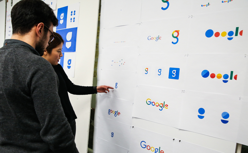
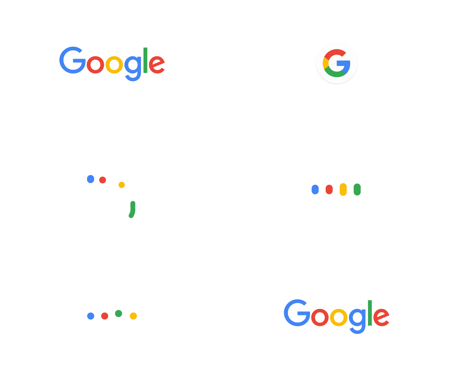
Now, on September 1, Google unveiled the new logo, including some animations derived from it: the initial letter G in collection of colors or the four colorful “loading” dots, dancing merrily together. It all looks and feels very well put together and proves that Google has thought a lot about the universal use of its branding across various platforms.
But I’m sure some Font Designers cried out when they saw Google’s new logo. For example, the capital letter G by itself is too light or thin.
I for one, do not mourn the old logo even for one second. I said above, Google’s new logo grows on you. In fact, I got used to it after 48 hours.
Most of all, I admire the well-orchestrated global launch of the new brand: from the search page, to all the subpages, to the icons of apps … to the favicons of its innumerable services. I also like the fact that Google has suddenly recognizes the identity-forming value of having their own font to use everywhere. Historically, even Google executives have publicly emphasized that fonts are really supposed to be freeware.
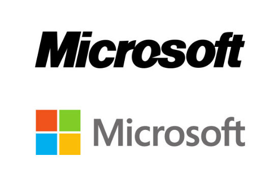
P.S. Doesn’t the change form the old to the new logo very much resemble the change that the Microsoft logo went through in 2012?


